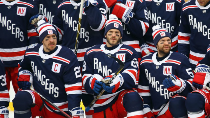
The badge…the worst ever
Season worn: 1976-77
It’s hard to pick just one Rangers jersey as the least aesthetic. Frankly, there were a handful of doozies. But if I was forced to choose only one – or else have to relinquish my PS4 and NHL 20 – it would be the 1976-77 disasters designed by the team’s general manager, John Ferguson.
Ferguson wanted a modern design and perhaps believed changing the team’s look would change its fortunes. What he got was pajama-lookalikes that didn’t end “The Curse”. If anything, the hockey gods probably extended the team’s Stanley Cup championship drought as punishment for subjecting their eyes to such an awful design.
I don’t even know where to begin with Ferguson’s egregious lapse in fashion sense. Nearly every aspect of these atrocities makes me queasy, but let’s start with the change in pants color from red to blue. When worn with the blue shirt, helmet and socks, the Rangers looked like enormous blue ballpoint pens on the ice.
The diagonal lettering down the front was replaced by the team’s badge. Don’t get me wrong, the badge is awesome, but not as the crest of a jersey. The stripe patterns on the sleeves, shoulders and waist changed (for the worse). The numbers were switched to a generic font and one color, no outline or drop shadow.
While the design didn’t go over well in New York and was abandoned after the 1977-78 season, Ferguson’s fashion designing efforts were not in vain. He took the very same scheme to Winnipeg where he served as general manager of the Jets, who after their final season in the World Hockey Association in 1978-79, joined the NHL.
Ferguson passed away in 2007 knowing he did right by the Rangers in luring Swedish sensations Ulf Nilsson and Anders Hedberg to Broadway from Manitoba’s capital. And, not that he’d necessarily care, but his Blueshirts uniforms aren’t alone in the homely department.
Here are the ugly relatives.
