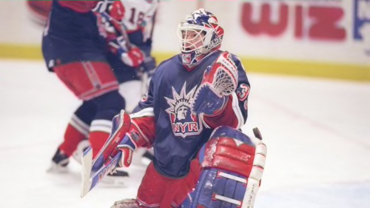
The Lady Liberty jerseys are once again part of the New York Rangers’ wardrobe — thankfully!
I was bummed when Reebok became the NHL’s official jersey supplier in 2007. Nothing against the athletic-wear company, but the switch brought two changes for the worse to the New York Rangers’ wardrobe.
The first was the waiter’s apron style jersey design. The “engineers” at Reebok tailored the design to meet the waistline at each hip with the idea that a player’s ability to pivot (and his overall maneuverability) would be greatly enhanced.
I don’t know anything about the dynamics behind the designing of a hockey jersey, but I’m quite certain my jersey wasn’t the reason I didn’t make the NHL.

The second was the retirement of the Lady Liberty jerseys — both the all-navy, introduced in 1996 and the all-white, which debuted in 1998.

The rarely seen white Lady Liberty Rangers sweaters worn by his greatness pic.twitter.com/2fgswu69RM
— A-aron 🏒⚾️🔥 (@BloodGrin946) October 24, 2020
The latest Lady Liberty jersey, introduced this week as part of the NHL’s Reverse Retro line to debut in 2021, is a plainer version of the original. Modest striping on the elbows and the elimination of the red on each forearm enhance the prominence of the Lady Liberty crest.
🔥🔥 👏🏼 👏🏼 🗽 🗽 https://t.co/5fsf5auNXh
— Ryan Strome (@strome18) November 16, 2020
It’s clean, classy, and it exudes New York City. And it’s by far the most attractive of any Reverse Retro jersey in the Metropolitan Division. Here’s how the rest of the Met’s Reverse Retros rank according to this Blue Line Station contributor.
Now that you've seen them all...
— NHL (@NHL) November 16, 2020
Which #ReverseRetro jersey by @adidashockey is your favorite? pic.twitter.com/wFZZzIv6nv
Metropolitan Division Reverse Retro Jersey Rankings
- Rangers.
- Washington Capitals. The Capitals’ look is a bit busier than the Rangers’ but it’s attractive and creative. The Capitol Building’s dome and cross hockey sticks are cool.
Reverse, Reverse #WallpaperWednesday | #ReverseRetro pic.twitter.com/BNTEX4yd0a
— Washington Capitals (@Capitals) November 18, 2020
3. New Jersey Devils. I don’t love it or hate it. However, it did remind me to add a Christmas tree to my Black Friday shopping list.
4. (tie) Carolina Hurricanes and Pittsburgh Penguins. I couldn’t stand either organization before one copied the Rangers (again) while the other replicated the Hartford Whalers’ look simply to sell more jerseys. There was already plenty to dislike: Tanking for the top overall pick. Breaking the hearts of true hockey fans to move to greener pastures populated by fair-weather hockey fans. Going bankrupt twice — including one time after winning two Stanley Cup championships.
And, now, the reincarnation of copycat jerseys.
Someone pass the Pepto.
Bad enough that Hartford fans — who stuck by the Whalers despite playing in the shadows of the Rangers and Boston Bruins and losing more than they won — saw their team bolt for North Carolina, win the Stanley Cup just eight years later as the Carolina Hurricanes, and resurrect the Whalers’ uniform as its third jersey.
A whale of a time https://t.co/82pQHsT4Gy
— Carolina Hurricanes (@Canes) November 16, 2020
Meanwhile, the Penguins are back to the diagonal lettering jerseys they copied from the Rangers upon entering the NHL in 1967. What’s really sickening is the Pens revisited this design in 1992-93 after winning two Stanley Cups and kept it for five years, all the while threatening to move to Kansas City … Las Vegas … the South Pole … or anyplace that would commit to building them a new barn.
The threads that bind 💪
— Pittsburgh Penguins (@penguins) November 17, 2020
Get Yours:
• Available for pre-order at @PensGear now
• In-store at PensGear on December 1
• In-store at @DICKS on December 6
Details: https://t.co/61INpKQpQG pic.twitter.com/Pz9vMRxKJY
6. New York Islanders. The Islanders might’ve been thinking of the Chinese fortune: “Better to keep your mouth shut and let people think you are a fool than to open it and remove all doubt.” Perhaps that’s why their Reverse Retro jersey isn’t much different than their home blues. Better to pretend the Fishsticks jerseys never existed than to resurrect them and the “We Want Fishsticks!” chants from the Madison Square Garden faithful.
Built on a Dynasty.
— New York Islanders (@NYIslanders) November 16, 2020
Introducing the #Isles adidas #ReverseRetro jersey. Hitting the ice in 2021. pic.twitter.com/ZhDGxbagwu
7. Philadelphia Flyers.
The Flyers would’ve been better off doing next to nothing as the Isles did. This design is hideous. The body of the jersey screams Broad Street Bullies, with the awesome crest against the traditional home orange, but the sleeves are way too busy, a lame attempt to fit in with the younger crowd. Somebody call Bill Belichick!
🔥🟠⚫️⚪️🔥#ReverseRetro | @adidashockey pic.twitter.com/olgUicFkru
— Philadelphia Flyers (@NHLFlyers) November 16, 2020
What do you think?
How would you rank the NHL Reverse Retro jerseys of the Metropolitan Division? Drop us a line below.
