

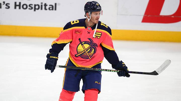
The NHL and Fanatics unveiled their latest league wide uniform initiative on Monday with the release of the "Hometown Remix" program after a lengthy period of teasing. In classic New York Rangers fashion, the organization played it remarkably safe.
While other franchises took massive creative swings, inverting retro colorways, bringing back wild fan favorites like the Islanders' Fisherman, or introducing vibrant trims, the Rangers essentially took elements of two previous alternate sweaters, mashed them together, and called it a day.
New York's newest threads 🗽
— New York Rangers (@NYRangers) November 2, 2026
Bringing together symbols of service, hope and unity in honor of our first responders and the city we call home. pic.twitter.com/VsnVKmdXI0
Modeled by winger Pavel Dorofeyev, the uniform serves as an homage to the city's first responders. Aesthetically, it heavily mirrors the deep navy Heritage sweater the Rangers wore in the mid-2010s while borrowing secondary color cues and the iconic Lady Liberty logo featured on both their Reverse Retro series and their current third jersey.
New threads call for fresh frames 📸 pic.twitter.com/y557EzaDCl
— New York Rangers (@NYRangers) November 2, 2026
Per the NHL, here's the design description for the Rangers' latest sweater:
A city of icons. With steel in its veins. This Hometown Remix jersey places Lady Liberty over the heart. Silver accents draw from the geometric metalwork found across New York’s landmark towers, giving the design a sharp, elevated edge. The front crest shifts to NEW YORK in stair step lettering, a bold departure from the traditional RANGERS wordmark. Sleeve striping carries a debossed pattern inspired by the torch base of the Statue of Liberty. On the hem, the city name is flanked by Liberty’s torches -- a proud symbol of the enduring nature of the city, and its fans. A captain’s patch on the left chest honors first responders, grounding the jersey in service and resilience. Stairstep numbers in hometown colors complete the look. This is a modern tribute to the skyline, the statue, and the city that never sleeps, designed to stand tall and united.
There are nice touches in the stitching, particularly the debossed torch patterns and the tribute to first responders. But from ten rows up at Madison Square Garden or on a television broadcast, it reads as just another dark blue Rangers alternate that doesn't move the needle.
The bolder alternate look the Rangers should have built
If the organization wanted to create something truly memorable, building an aesthetic around their 2024 Stadium Series design would have been an exceptional canvas.
That MetLife Stadium look proved that a predominantly white jersey with bold, classic sleeve striping mirroring the team's traditional home look can work wonders. It was also designed in such a way to stand out, because people were trying to look at the players on the ice from the stands of a football stadium.

Basically, this is what I had in mind.
Instead of recycling the massive diagonal "NYR" wordmark or the standard "NEW YORK" stairstep text, the Rangers could have reached into their vault for the alternate shield logo used from the 1996–97 through 2006–07 seasons.
That Wayne Gretzky-era shield remains one of the cleanest secondary marks in franchise history. Placing that shield front and center, while incorporating the apple logo utilized for the 2026 Winter Classic as a captaincy patch base, swapping in a "C" or "A" inside the apple rather than the standard block font, would have struck the perfect balance. It would have celebrated local iconography, honored different eras of Rangers hockey, and delivered an entirely fresh, modern aesthetic.
Missing a rare opportunity to break from tradition
Will the Hometown Remix sweaters sell out at retail? Absolutely.
The team's primary home and away sets are among the most sacred and untouchable in professional sports, and nobody is advocating for changes to the classic diagonal "RANGERS" diagonal blue sweater. But rare league-wide initiatives like Hometown Remix are designed precisely so original franchises can let their hair down and take design risks without alienating purists.
The Rangers chose the conservative middle lane, delivering a safe, familiar uniform rather than an ambitious one. In many ways... the decision is very on brand. It is a respectable sweater, but it could have been so much more.
 Add us as a preferred source on Google