New York Rangers fashion dos and don’ts

Lady Liberty
Seasons worn: 1997/1998/2000-07
New York Rangers Liberty Throwback Jerseyhttps://t.co/uqWbu6UsWo pic.twitter.com/F0zZYZ6ZL7
New York Rangers Liberty Throwback Jerseyhttps://t.co/uqWbu6UsWo pic.twitter.com/F0zZYZ6ZL7
— fashionsportskevin (@Bulldogsjersey1) April 27, 2020
Plus: The original Rangers blue was darkened to navy. … The crest is unmistakably New York City. … The Rangers used a white version of this jersey in 1999 only. …The silver stripes on the arm and neck don’t look forced — as it does on the current Buffalo Sabres’ sweaters.
Minus: The disjointed shield patch on each shoulder. The team went for a modern look. It shouldn’t have.
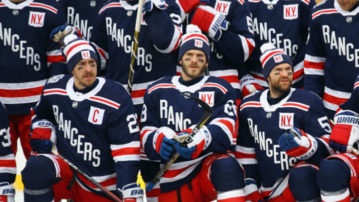
Special Event Jersey
Plus: The all-white lettering of R-A-N-G-E-R-S spelled diagonally on the front and numbers on the back is a nod to the team’s original style in 1926-27 (though the 2018 version is navy blue as opposed to royal). … The white badge with the letters N.Y. in red over the heart is a classy touch. … The event patch on the shoulder is cool.
Minus: The least-expensive version does not feature the badge or event patch. Talk about a double slap to those with less disposable income. Seriously, would profits be cut so dramatically by including the badge?
Adam Graves is the #HUT Hero for the @NYRangers!
— EA SPORTS NHL (@EASPORTSNHL) September 1, 2016
Details: https://t.co/GyTlKPEn02 pic.twitter.com/UA5h9sviHP
nbsp;
NHL 75th Anniversary
Season worn: 1991-92
Plus: A clean, crisp throwback to the jersey the team wore from 1929 to 1934. … The red lettering trimmed in white and spelled diagonally on the front in generic font lays nicely with the blue, as do the white and red stripes and all-white collar. … The NHL’s 75th logo patch on the front is a dandy.
Minus: Per league rules, player names are spelled (straight across) the top in back. Tacky. If it’s supposed to be a throwback, then it should precisely replicate the original. … The numbers on the sleeves are shabby, as well.
Heritage Jersey
Seasons worn: 2010-11 through 2016-17
Plus: Commemorated the franchise’s 85th anniversary in 2010-11. … Usually worn versus Original Six opponents. … Featured each of the team’s retired numbers sewn into the bottom hem.
Minus: The words “New York” appear diagonally down the front. “Rangers” would’ve been the more nostalgic choice. … Cream replaces the white.
Now that we’ve taken a look at the aesthetically appealing Rangers’ jerseys, it’s time to look at the Blueshirts’ sweaters worth donating or burning.