

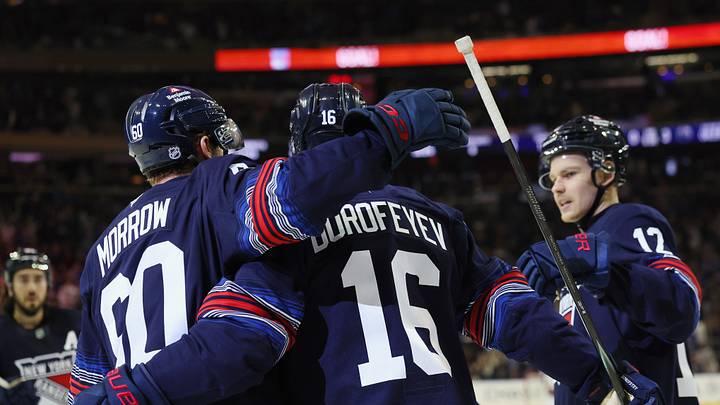
On Monday, the NHL finally dropped its long-awaited "Hometown Remix" collection, unveiling a 32-team slate of alternate sweaters that every club will rotate through for the remainder of the season. The Rangers are slated to wear their newest threads across five games, kicking things off against a division rival in the Philadelphia Flyers—who unveiled their own remix the exact same day. So, who in the Metropolitan Division walked away with the best look, and who completely fumbled the assignment?
1. Washington Capitals
The Capitals, @NHL and @Fanatics unveiled the club’s Hometown Remix uniform, a special edition look that celebrates the fans, fabric and culture of Washington, D.C.
— Washington Capitals (@Capitals) November 2, 2026
Part of a league-wide program, the Capitals’ uniform marks the culmination of a two-year development process.
The Caps went back to their old Capitol building logo for this one, a look from when the great Alex Ovechkin first stepped onto NHL ice and the rest became history.
It's not the first time the Caps have leaned into a blue, gold, and black palette from that late-'90s era, but unlike their Reverse Retro sweaters that featured the famous "Screaming Eagle" crest prominently on the front, this one puts the Capitol dome center stage. It's one of the best designs in the entire 32-team collection, featuring the team's primary logo from 2002 to 2007. The old gold and white accents really bring the whole jersey together, and speaking of those Screaming Eagles, they are still there, emblazoned right on the shoulders in the same gold.
The Caps' newest sweater was a consensus top-five vote across the league, making it an easy choice to kick off our ranking at the very top.
2. Pittsburgh Penguins
Painting the 412 blue 🏙️ pic.twitter.com/1xlObG7zWI
— Pittsburgh Penguins (@penguins) November 3, 2026
If you thought the Caps one popped, this one does it even more and then some.
Inspired by the famous art movement, the Penguins' pop art look carries a fantastic neon appearance, spearheaded by one of the Steel City's most famous icons — Andy Warhol, who became one of the greatest artists of his generation. This jersey definitely has glow-in-the-dark potential, and it leans into vibrant accent shades that make it stand out immediately, earning its spot at number 2 on this list.
Perhaps factoring in a bit more hockey nostalgia could have vaulted this look into the top spot, but it is still a killer design. I guess the '90s "Robo-Pen" was already off the table after serving as the centerpiece for their Reverse Retro 2.0 sweaters, but taking a swing on Pittsburgh art history was well worth the risk.
3. New York Islanders
The Fabric of Long Island.
— New York Islanders (@NYIslanders) November 2, 2026
It finally happened. The man, the myth, the legend is back.
The seafarer, the Gorton's Fisherman mascot, is on a 21st-century Isles sweater, and it is amazing. With paler blue and orange accents cutting across a crisp white background, the road version of one of the league's most infamous cult classics can finally be bought on the modern-day internet. Add the shoulder patches featuring the iconic lighthouse alternate logo, and you get a jersey that isn’t too far off from its counterpart of 30 years ago. It’s fresher, bolder, and so worth the wait.
Back then, the Isles only used this primary look for two seasons from 1995 to 1997 because, at the time, it was almost universally despised. Today, it hits for an entirely different crowd, and putting the wave striping on a clean white canvas gives it an undeniable, modern retro vibe.
4. New York Rangers
New threads call for fresh frames 📸 pic.twitter.com/y557EzaDCl
— New York Rangers (@NYRangers) November 2, 2026
Now moving to the other side of New York, the Rangers introduced a mix of their recent Reverse Retro looks and the mid-2010s Heritage aesthetic, bringing back elements from when their first true alternate logo was Lady Liberty herself.
This time around, Liberty sits over the left chest area, giving the entire sweater a distinct, soccer-style crest placement. The Lady Liberty shield served as an iconic alternate identity for the Rangers from 1996 to 2007, debuting just two years after their 54-year Stanley Cup drought was broken. Placing it at number 4 feels fair for the Metropolitan Division, but it hasn’t been nearly as well received by the rest of the league, landing with a rough leaguewide consensus ranking of 28th. By comparison, the Islanders’ Fisherman revival nabbed a spot just outside the league's top 10.
Luckily for the Blueshirts, there are four other Metro Division teams that left a fair amount to be desired, to put it mildly.
5. Columbus Blue Jackets
There’s a lot to love about our city. Now there’s a new way to show it 💥
— Columbus Blue Jackets (@BlueJacketsNHL) November 2, 2026
Introducing Hometown Remix. Individually designed to honor the history, community, and fabric of Columbus. pic.twitter.com/59Qh3FbC86
The Jackets pulled from their Stadium Series look against the Red Wings and made it even better, rolling out a cream, off-white primary base rather than the heavy navy they wore outdoors.
Even for such a young team — the franchise was awarded in 1997 before taking the ice in 2000 — they managed to craft a solid, retro-inspired aesthetic, which plenty of younger franchises across professional sports struggle to pull off. Featuring the almighty cannon, which has been a staple of home games since 2007 and serves as their primary alternate crest, Columbus amped up its outdoor look with a classic vintage vibe that fits perfectly.
Of course, we have to address the elephant on the ice: putting a team named the Blue Jackets — an identity rooted in Ohio's Union Army heritage — into a jersey officially marketed as solid grey definitely raised a few eyebrows online. But historical color ironies aside, that cannon set against the off-white and grey accents looks sharp. It's the right amount of loud, just not quite as loud as it usually is inside Nationwide Arena. I can personally vouch for that twice. It doesn't matter what section you're sitting in, that sucker is LOUD and PROUD!
6. Carolina Hurricanes
Struttin’ into a new vibe pic.twitter.com/Q14rd31ccv
— Carolina Hurricanes (@Canes) November 2, 2026
The Metropolitan heavyweights got extra creative with their look, and it's true the Canes have always known a thing or two about alternate identities.
More often than not, it seems the team leans into its double red storm warning flag logo rather than the actual swirling hurricane crest, wearing their alternate black jerseys over their primary home reds. That bold approach paid off for the Hometown Remix collection as well (I guess the Whalers looks were finally phased out), featuring a cartoonish, strutting version of their beloved mascot, Stormy.
The blue-eyed ice hog has deep ties to the state of North Carolina, if you have ever wondered why a team named the Hurricanes picked a pig as a mascot instead of a literal storm. For one, North Carolina had a massive hog farming industry in the late '90s when the franchise relocated from Hartford, Connecticut. Plus, there is a reason why the previously mentioned Blue Jackets didn't try to make an actual cannon their mascot before leaning into Stinger, their green-headed hornet persona. It would have looked pretty ridiculous, honestly.
7. Philadelphia Flyers
This is the Independence Edition. pic.twitter.com/tysCSehAIZ
— Philadelphia Flyers (@NHLFlyers) November 2, 2026
Now we get to the "left a fair amount to be desired" tier, starting with the Flyers.
The team's abysmal start to the season didn't get much of a silver lining with the Hometown Remix collection, which delivered a primarily heathered grey jersey... and that is pretty much it.
The one saving grace for this look is that the numbers on the back feature a cracked pattern across the bottom — referencing one of America's most famous landmarks, the Liberty Bell itself, located right in the City of Brotherly Love. But to be completely honest, it feels like the bare minimum they could have done outside of their previous Reverse Retro looks, which looked significantly better than these. And even those didn't have an overwhelming amount of retro vibes!
With the country celebrating 250 years of American independence, this was not exactly the most inspiring way one of the nation's first capitals could have celebrated the milestone.
8. New Jersey Devils
We stand together. We stay defiant.
— New Jersey Devils (@NJDevils) November 2, 2026
It's not a jersey announcement without @MCRofficial.
Remember how Columbus improved on their outdoor look with their Hometown Remix jersey?
The Devils only pulled off half of that equation, rolling out a design that looks almost identical to their 2024 Stadium Series look. The problem is, they forgot the most important part of the assignment — actually making it fresh.
Outside of removing the enclosing circle from the primary crest to let the horns and tail stand on their own, it is honestly pretty basic. Considering how many times fans have begged them to lean back into their vintage red-and-green "Christmas colors" roots, delivering another muted black-and-red retread feels like a sizable misfire from the Devils.
It might not be the single worst look across the entire 32-team collection, but it is comfortably sitting in the bottom 10 leaguewide — and right here at the bottom of the Metro barrel.
 Add us as a preferred source on Google