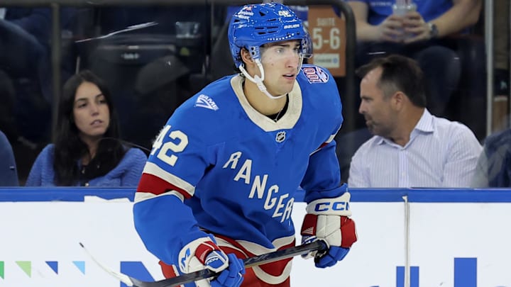
The New York Rangers have some clean, crisp alternate uniforms for their centennial season, but the panel over at The Athletic didn't think so. Taking 10 teams that unveiled their alternate sweaters over the summer, Sean Gentille, Shayna Goldman, and Julian McKenzie ranked the Blueshirts' alternates a paltry No. 7 on the list, with Gentille giving the jersey a fair 7 out of 10 while Goldman and McKenzie gave it a 6.
Of the trio, McKenzie gave the deepest explanation, saying, "I don’t think they’re awful, but I don’t think they’re amazing. I like the placement of ‘Rangers’ on the front of their jersey. But I’d much rather see it on a darker blue base, kind of like the blue they wear on their current home jerseys. I also think the shoulders are too plain for me. Finally, this being the jersey for your centennial is underwhelming. I expected something bold, majestic and royal from one of the league’s most iconic teams. But I will concede these jerseys look a bit better on television than I thought they would."
To be frank, the panel got it wrong. The shade of blue gives off a cool, calming vibe, and the classic 'stairstep lettering' with the RANGERS wordmark is timeless. Plus, there is enough color contrast between the wordmark, numbering, and the jersey itself that nothing is hard to read on a TV screen.
The Athletic got it wrong with the New York Rangers centennial uniform
While it would have been tough to outclass the Detroit Red Wings, who ranked No. 1 on the list and built a uniform that blended different eras of hockey, the Rangers should have ranked, at worst, No. 3. Only the Wings' and Minnesota Wild's looks gave them serious competition, but The Athletic's panel, for whatever reason, thought otherwise.
So, who else beat the Rangers? The Seattle Kraken and their glow-in-the-dark jerseys, somehow, took the No. 2 spot. You don't play hockey with the lights out, so there was no logic in making uniforms glow in the dark, except for the few seconds when the arena goes dark to introduce the team. But overall, it's gimmicky.
It's hard to put many of these uniforms ahead of the Rangers
The Washington Capitals clocked in at No. 3 with an updated version of their "Screaming Eagle" look, but with their current team colors. Overall, it didn't make the "Screaming Eagle" fare any better. Meanwhile, the Minnesota Wild took fourth, reviving a throwback concept, and a good one at that.
The San Jose Sharks snagged the No. 5 ranking, throwing back to the 2000s, and the Los Angeles Kings took sixth with the crown look. San Jose's throwback is a nice nod to those 2000s teams, but it doesn't top the Rangers' centennial by any means. And the Kings' crown jersey is fine, but wow, what a missed opportunity. Bringing back the purple and gold would have knocked it out of the park.
Who finished behind the Rangers? The Edmonton Oilers ended up in eighth, with their white "Scripted Oilers" jersey. Not a bad look at all, and one that should have also ended up higher on the list.
The final two spots went to the Pittsburgh Penguins and Ottawa Senators. Pittsburgh's gold alternates were 'meh' at best, especially when paired with the gold helmets. They looked like knock-offs of the Nashville Predators' current threads.
And finally, the Sens' look is better suited for a minor league hockey team with that generic logo and way too much red. Until they bring back the 'O' from the original Senators, these uniforms will always lag.
So, of all the uniforms that were ranked, the Rangers should have taken the silver medal and clocked in right behind the Red Wings. At worst, the Wild would have passed them, dropping the Blueshirts to the bronze.
